NxTrad by IOURING Launches India’s First Relative Rotation Graph (RRG) Charts
Lost in the Noise of Market Movements? You’re not alone. With countless assets rising and falling daily, it’s easy to feel overwhelmed trying to track what’s performing, what’s lagging, and where the real opportunities lie.
Traditionally, charts only show a part of the picture. They can tell you what’s up or down, but not why, not in relation to others, and certainly not with any sense of momentum. Without a clear view of relative performance, you could miss key turning points or continue investing in underperformers.
That’s where Relative Rotation Graphs (RRGs) step in. RRGs provide a clear, visual way to compare multiple assets against a benchmark, showing current performance, momentum, and direction. You can instantly spot leaders, laggards, and those gaining strength. It’s like upgrading from a compass to a GPS in your investment journey.
In this article, we’ll break down what RRGs are, how they work, and why they’re becoming a go-to tool for investors who want clarity in the chaos. Whether you’re new to technical analysis or looking to refine your strategy, this guide will equip you to make sharper, more informed decisions.
Why Traditional Relative Strength Falls Short?
Relative Strength (RS) has long been a go-to metric for investors looking to compare the performance of a security against a benchmark or another asset. It’s simple, effective, and widely used for making one-on-one comparisons.
But in today’s fast-moving markets, where portfolios span sectors and asset classes, traditional RS begins to show its limitations. Analyzing relationships across multiple securities becomes tedious and time-consuming, often requiring manual, pairwise comparisons that slow down the decision-making process.
Even more challenging is the lack of visual context. Traditional RS doesn’t capture the dynamic nature of market trends. You can’t easily see how performance shifts over time or identify emerging leaders and laggards across a group of assets. This makes it difficult to detect broader sector rotations or intermarket movements that could be critical for positioning.
In short, while RS is helpful for isolated comparisons, it falls short when scale, speed, and trend visualization are key. That’s where modern tools like RRG Charts step in to fill the gap.
What is a Relative Rotation Graph?
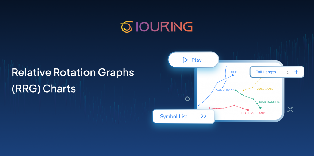
Relative Rotation Graphs (RRG) Charts are a powerful visualization tool used to compare the relative strength and momentum of multiple securities against a common benchmark, all in a single, easy-to-read chart. Developed by Julius de Kempenaer, RRG Charts help investors move beyond single stock analysis and gain a broader view of market dynamics.
Each security is plotted as a point that moves over time through four quadrants: Leading, Weakening, Lagging, and Improving.
The horizontal axis represents relative strength, while the vertical axis shows momentum. As assets rotate through these quadrants, RRG Charts provide a dynamic view of market leadership, trend reversals, and sector rotation, helping investors make better-informed decisions with clarity and speed.
Understanding the Parts of the Relative Rotation Graph
Relative Rotation Graphs (RRGs) are unique four-quadrant charts that help visualize the relative strength and momentum of multiple securities compared to a benchmark.
At the heart of the chart:
-
- The X-axis represents the Relative Strength Ratio (RS-Ratio)- how well a stock is performing compared to the benchmark.
-
- The Y-axis shows Relative Momentum (RS-Momentum)- the speed and direction of that relative strength over time.
Each security moves clockwise through four quadrants:
-
- Leading- Strong relative strength and positive momentum
-
- Weakening- Still strong, but losing momentum
-
- Lagging- Weak performance and declining momentum
-
- Improving- Gaining momentum with potential to lead
This layout allows investors to track changes in performance over time with clarity, making it easier to identify sector rotations, trend reversals, and emerging opportunities.
By combining RS and momentum in one chart, RRGs overcome the limitations of traditional pairwise comparisons and bring a multi-dimensional perspective to relative analysis, ideal for traders and portfolio managers looking to optimize positioning across sectors or asset classes.
How to Interpret Relative Rotation Graphs?
Relative Rotation Graphs (RRGs) provide a clear, visual approach to analyzing the relative performance and momentum of multiple securities against a benchmark. Securities typically rotate clockwise through the four quadrants, reflecting changes in performance trends over time.
Assets in the Leading quadrant show strong relative strength and accelerating momentum, indicating consistent outperformance. Those in the Lagging quadrant reflect weakness on both fronts, underperforming peers and losing momentum. The Improving quadrant highlights assets gaining strength and potentially gearing up for leadership, while the Weakening quadrant flags those that, despite past strength, may be starting to lose steam.
The distance from the chart’s center represents the intensity of strength or weakness. RRGs often feature tails to show historical movement, helping investors assess trend duration and volatility.
By observing these patterns, investors can identify market leaders, spot potential reversals, and time sector rotations effectively. Whether it’s a stock gaining momentum or one losing its edge, RRGs offer an intuitive way to make informed, data-driven investment decisions in dynamic markets.
Identify Market Leaders: RRGs help pinpoint stocks that are outperforming a benchmark with strong momentum. Assets in the Leading quadrant exhibit consistent strength, making them potential leaders in the market. Tracking their movement and stability provides insight into sustained performance and helps investors allocate capital to high-performing sectors or stocks.
Spot Potential Reversals: RRGs visualize the shift in momentum and strength, allowing investors to detect early signs of trend reversals. For instance, a move from lagging to improving may indicate a recovery. By analyzing directional changes and tail patterns, traders can anticipate shifts in market behavior before they become broadly evident.
Time Sector Rotations: With RRGs, sector rotation becomes easier to track by watching how groups move between quadrants. An industry rotating into the Leading quadrant signals emerging leadership, while a shift into Weakening suggests waning performance. This enables investors to strategically reallocate their portfolios to align with changing market trends.
Key Benefits of Using Relative Rotation Graphs
1. Simplifies Complex Market Analysis
RRGs offer a straightforward, visual approach to analyzing the relative performance of multiple securities. By plotting strength and momentum on a single chart, traders can quickly interpret complex market behavior.
2. Tracks Market Leadership
These graphs clearly identify which assets or sectors are leading or lagging compared to a benchmark. This insight helps in recognizing current outperformers and anticipating potential shifts in leadership.
3. Enhances Portfolio Management
RRGs support more agile asset allocation by revealing changes in relative performance. Investors can dynamically adjust their holdings based on evolving trends.
4. Identifies Early Rotation Signals
By visualizing how securities move through different quadrants, RRGs reveal emerging opportunities and risks—often before they’re reflected in price action.
5. Improves Decision-Making
Clear insights into trend direction and momentum empower investors to make timely, evidence-based decisions that align with their strategies.
6. Integrates Seamlessly with Other Tools
RRGs work well alongside traditional technical indicators, offering a broader perspective and helping confirm or challenge other signals.
7. Saves Time
By consolidating comparative performance data into one chart, RRGs streamline analysis and reduce the need for multiple manual comparisons.
8. Useful Across Timeframes
Whether you’re making tactical short-term trades or long-term investment decisions, RRGs adapt to your preferred timeframe.
9. Educational Insight
RRGs are also great learning tools, helping traders understand the dynamics of sector rotation and the interplay between strength and momentum.
Conclusion
Understanding market momentum and rotation has never been more important, and Relative Rotation Graphs (RRGs) make that possible in a powerful, visual way. Instead of sifting through multiple charts or pairwise comparisons, RRGs allow traders to see how assets move relative to a benchmark, revealing which securities are gaining strength, losing momentum, or poised for a reversal.
Now, with NxTrad introducing RRG Charts, this advanced analysis becomes more accessible than ever. Seamlessly integrated into the NxTrad platform, RRGs give traders a clear edge in spotting emerging leaders, identifying laggards, and timing sector rotations more efficiently.identifying laggards, and timing sector rotations more efficiently.
With NxTrad’s addition of RRGs, you’re not just watching the market, you’re reading its rhythm. It’s a smarter way to trade, and a step forward in evolving how modern market analysis is done.